The Nestlé Rebranding
The Nestlé rebranding project, completed as part of my studies, aimed to address the brand’s challenge with child labor by emphasizing its dedication to building a better future for all.
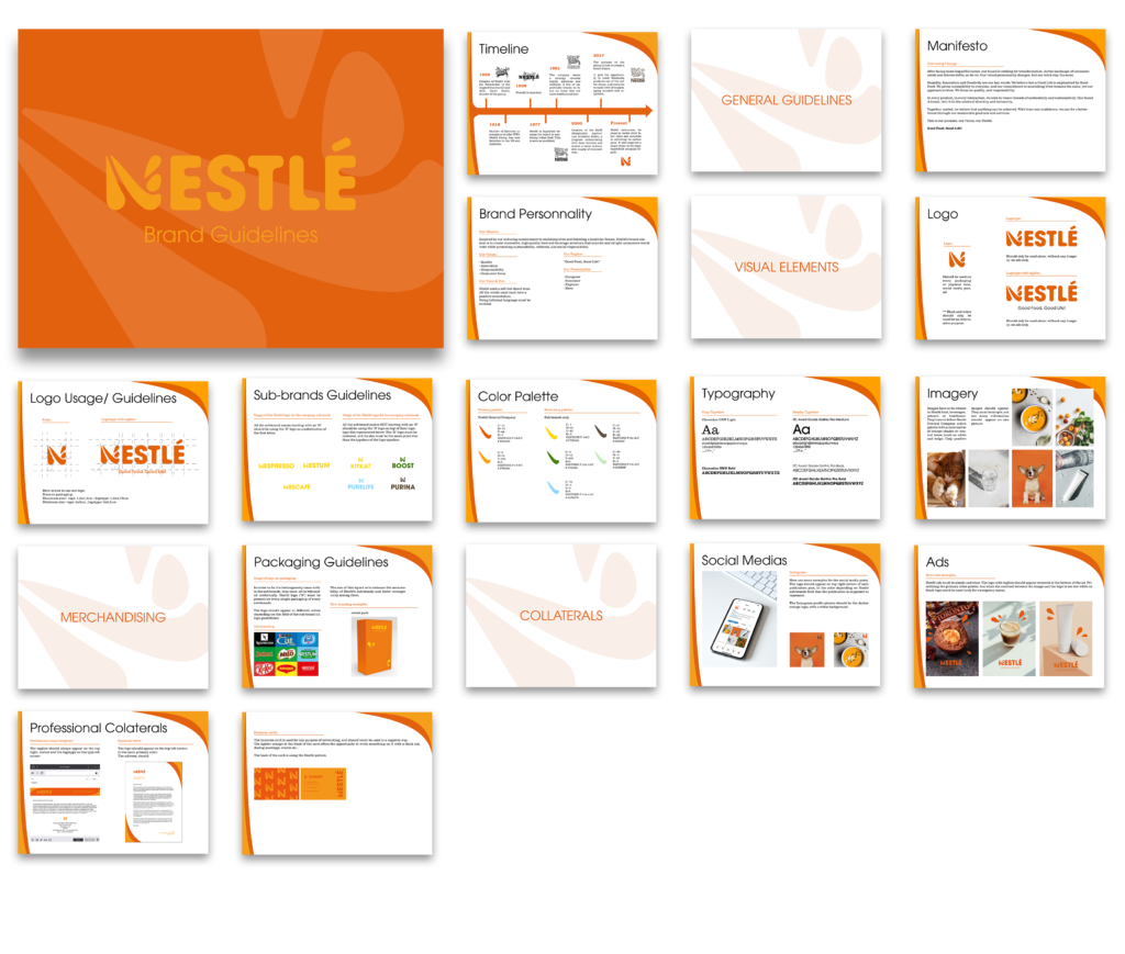
I created a fresh, bold, modern, and vibrant visual identity, removing the bird from the logo, often linked to childhood, to mark a fresh start. Orange was chosen as the primary color for its warmth, vibrancy, and modern energy. The rebrand extends beyond the logo, covering the entire brand identity system, including a comprehensive brand bookand various collateral elements.
The new visual identity
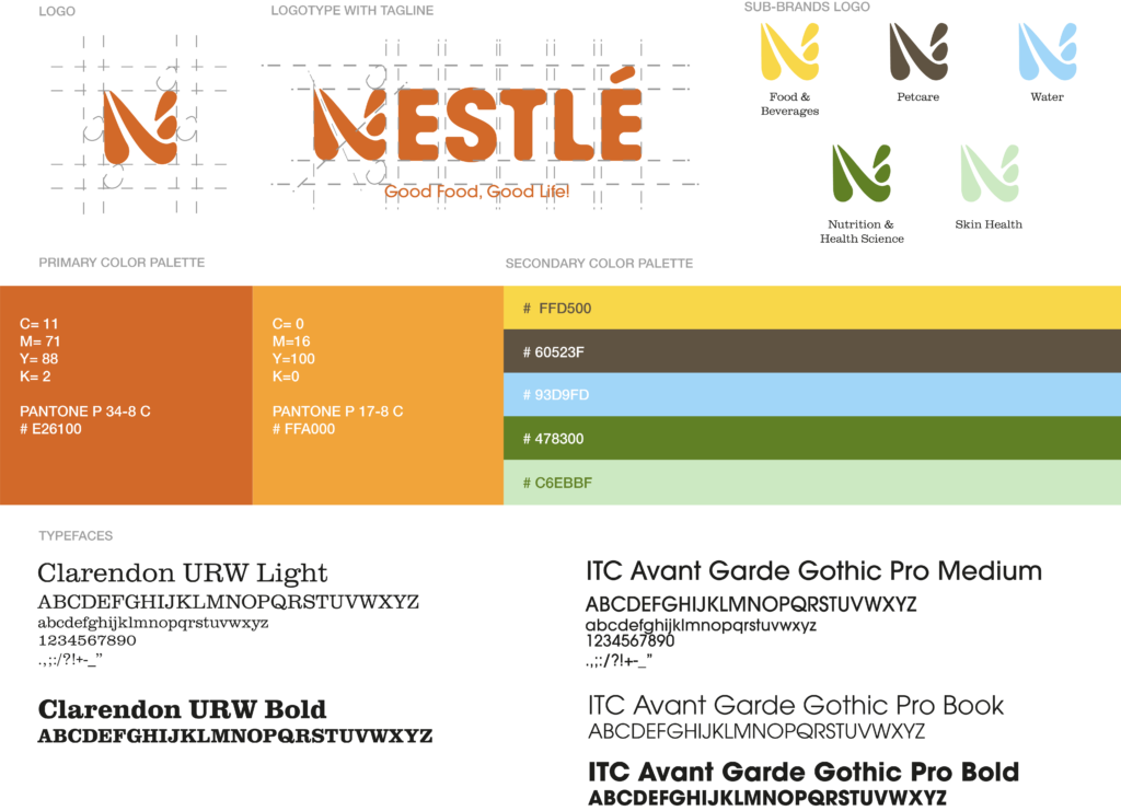
The brand guidelines
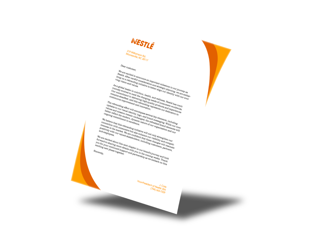
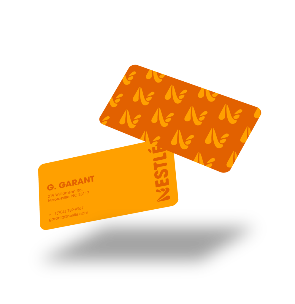
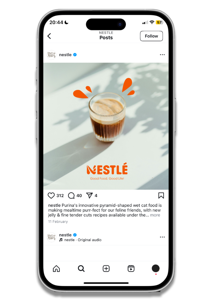
The collateral
The various collaterals are designed to be cohesive, each featuring the logo for brand recognition.
I designed a pattern on the back of the business card to enhance visual interest, while small shapes derived from the logo are used in social media posts to maintain visual consistency across platforms.